As part of the 2023 Ihaka lecture series Bringing numbers to life we ran a data visualisation competition with three categories reflecting each lecture topic.
Watch the lectures again
- Antony Unwin, Interactive Graphics and Data Analysis
- Danielle Navarro, Unpredictable paintings: Making generative artwork in R using data visualisation tools
- Chris McDowall, What’s Behind the Map: The Process of Data Visualisation
The submissions were numerous and all excellent! Below are the chosen winners as well as some submission the panel thought deserved a special mention.
Winning entries
Holey Moley

About Avi
I am a postdoctoral research fellow at the University of Auckland, working with Prof. Renate Meyer. The focus of my research is to study black holes that smash into one another (using Bayesian inference and gravitational wave data).
About the submission
I really enjoyed Danielle Navarro ’s talk and was inspired to try my hand at some generative art! I made some using techniques they discussed during the worksop. I mostly messed around with iterative processes, and playing with the projection of the plots. I started with random walks, then played with some N-body chaos visualisations and finally settled on messing around with some functions plotted in polar coordinates. All the code and other plots can be found here
Auckland Transport Bus Performance Dashboard
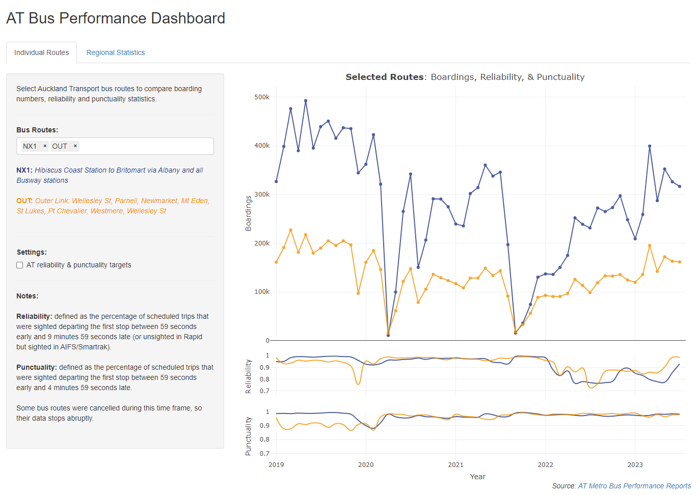
About Matthew
I’m in my second year studying a BSc in Statistics and Computer Science at the University of Auckland.
About the submission
An interactive dashboard that allows users to compare performance statistics of all Auckland Transport bus routes. The visualisation was made over the mid-semester break as part of a STATS 399 project. It was made using the shiny and plotly packages in R. The data comes from Auckland Transport patronage report spreadsheets.
Statistical Portrait: Ihaka’s Insights in Words
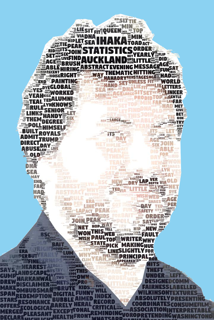
About Joseph
Undergraduate statistics student. Likes to procrastinate his exam study by entering data visualization competitions.
About the submission
I’ve written an algorithm (python), which fits a word cloud to the shape of an image. In this example I have used a portrait of Ross Ihaka.
All of the words in this word cloud have been collected from the 2023 Ihaka lecture series.
The original idea for this came from a STATS 399 project which I completed this semester.
*Note, I have manually altered the frequency of some words in order to emphasize what I felt were most relevant to this submission.
Special Mentions
Circular Legacy
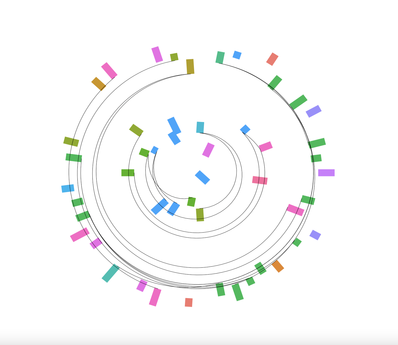
About Sriya
My name is Sriya, and I’m a student at the University of Auckland, studying a Bachelor of Science majoring in, Statistics & IT Management. Through generative art, I explore the intriguing interplay of diversity, connection, and artistic expression, exploring the beauty that arises from these intersections.
About the submission
Circular Legacy is a generative art piece exploring connections among artists, symbolising life’s essence and personal experiences through data from the Kaggle dataset Best Artworks of All Time.
The centre of the circular canvas denotes earlier periods, moving outwards indicating recent eras. Coloured segments signify nationality; segment width reflects lifespan, encapsulating each artist’s perspective, triumphs, and challenges.
Circular Legacy reveals connections between artists sharing a common genre, uniting them through threads of expression. It transcends time, nationality, and genre, celebrating artists’ enduring impact on our world—a testament to their artistic legacy.
Inequality (The Rich Get Richer)
About Satoshi
Satoshi is an applied mathematician currently pursuing his PhD degree at the University of Auckland. His research interests centre around complex systems, network science, and data science. Additionally, he has recently developed an interest in generative art as a means of communicating his ideas to a wider public.
About the submission
Power-law distribution, also known as Zipf’s law in linguistics or the Pareto distribution in economics, is pervasive in various fields. This phenomenon is closely tied to the principle of preferential attachment, often referred to as “the rich get richer.” In this artwork, I have implemented the preferential attachment algorithm and visually depicted how it culminates in inequality. The visualization illustrates the inherent tendency for certain elements to accumulate more, accentuating the disparities within systems, whether it be in the distribution of wealth, the frequency of words in language, or other complex systems.
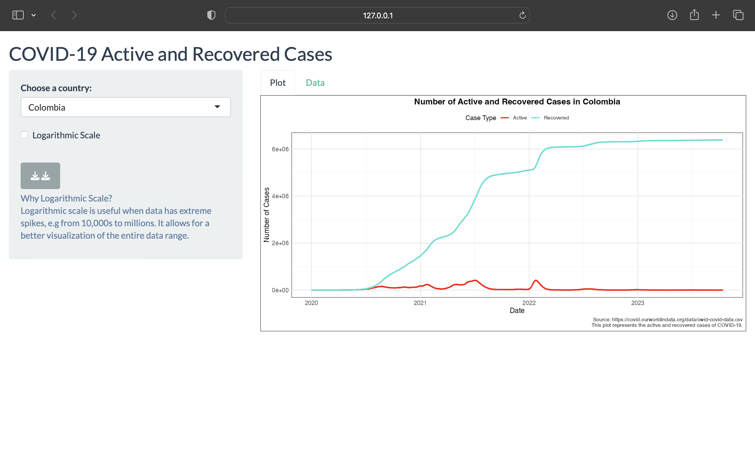
Covid-19: Active & Recovered Cases
About Brittany
I’m a relentless explorer of the world of statistics. My journey is fueled by a hunger for knowledge and a commitment to driving positive change through data. Outside of the data world, I’m a people person – a Class Rep who excels in public speaking and collaboration. I also embrace physical challenges, taking on boxing and enjoying the meditative serenity of surfing and swimming.
About the submission
This interactive Shiny application provides a visualization of COVID-19 active and recovered cases by country. Users can dive into specific countries, toggle between linear and logarithmic views, and better understand the trends and magnitudes of the pandemic through a table of counts. This dataset likely contains various COVID-19-related information, and my app focuses on visualizing active and recovered cases based on these data.
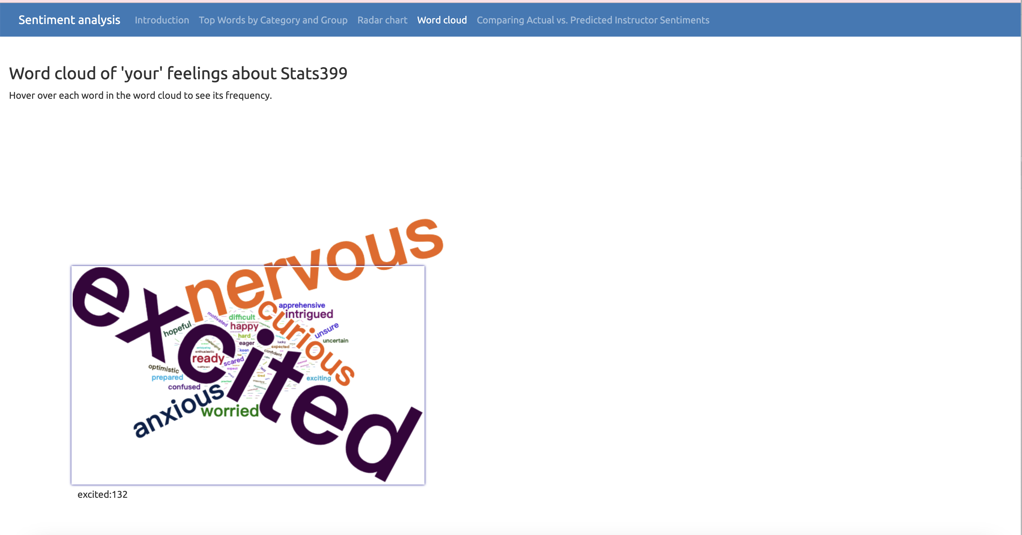
Sentiment exploration With Shiny: dynamic word cloud
About Chelsea
I am a third-year student majoring in statistics and psychology. I’m pleased to participate in the visualization competition, showcasing a graphic from an application I personally created. This was an entirely new endeavor for me, and I invested a significant amount of time into this project. I take great pride in the work I’ve accomplished. I’m drawn to challenging tasks and enjoy learning how to solve problems.
About the submission
This exploration delves into the optimisation of Sentiment Analysis using data from classmates and instructors visualised through a Shiny app. The Shiny application features a profile page, Radar Chart Visualization, dynamic Word Cloud, table of top words. The integration of data rigour and modern digital tool interactivity aims to enhance user engagement and understanding.
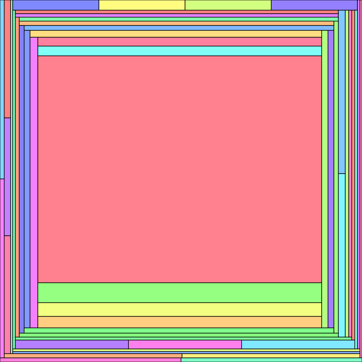
One that deserves a category all on its own!
Don’t count your grobs
One that Ben’s students might appreciate!
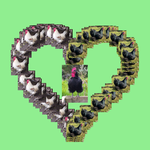
About Ben
I am an enthusiastic chicken-keeper and R user. Here I blend together my two passions to create a masterpiece.
About the submission
This image represents many types of love: (1) the love that my rooster Bennett (left side of heart) has for my hen Evelyn (right side of heart), (2) the love that both Bennett and Evelyn have for their son Clarence (centre of heart), and (3) the love that I have for all of my chickens.
The number of times Evelyn and Bennett appear in the image are random variables, which just goes to show that you can’t count your grobs until they are drawn.